ScienceIO Annotate
About this project
ScienceIO’s AI-assisted labeling platform gives you to the tools to turn documents into data. Documents are automatically labeled, and you have the ability to adjust them and add your own. Annotate healthcare records, protocols, and papers more than 20x faster than manual labeling.
The Team
Designer
1
2
Front-end Engineers
Back-end and
Machine-Learning Engineers
4
1
Product Manager

My Contribution
Developed a Figma component library to use across all designs and prototypes and led the implementation into Storybook, allowing for more consistent designs and easier UI changes across our multiple products.
Designed ScienceIO Annotate product end-to-end product (iconography, typography, sign up, plan selection, dashboard flow, search functionality, widget components, and more).

Early Sketches
Layout and label exploration


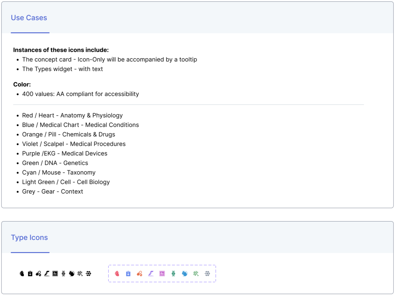
Concept Type Iconography
These icons were created to show users “concept type. The color of these icons is used to display the found concepts throughout Annotate. They are never without additional content whether it be with text or tooltip.
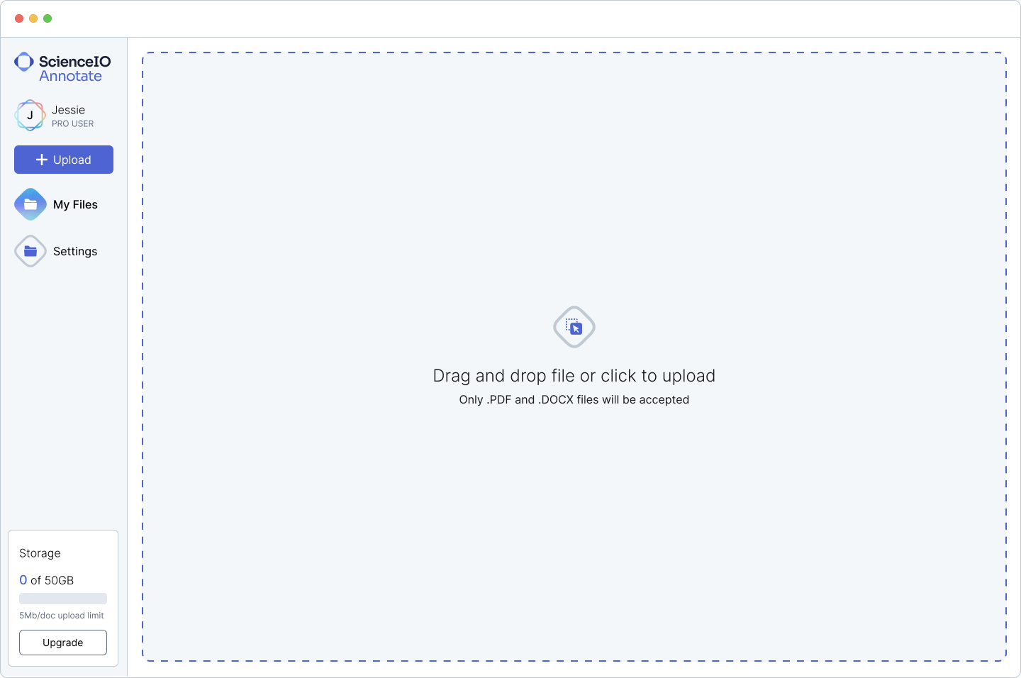
Annotate File Directory

Widgets Spotlight
The left side panel in the application is designated for contextual information related to the annotated document.
Type widget: Displays the type of content in document.
Users can determine if the document primarily pertains to Medical Conditions or Medical Devices.
Model Confidence: Displays how confident our model is.
Users can see how confidently the model identified the scientific concepts.
Top Concepts: Displays the most frequently occurring concepts identified in the document.
Users can view the main concepts discussed in the document.
Progress: Displays the user’s progress in the document. View how many concepts has the user reviewed or added to the document.
One of the user’s goal while viewing this document is to determine if the concepts identified by the model are correct.

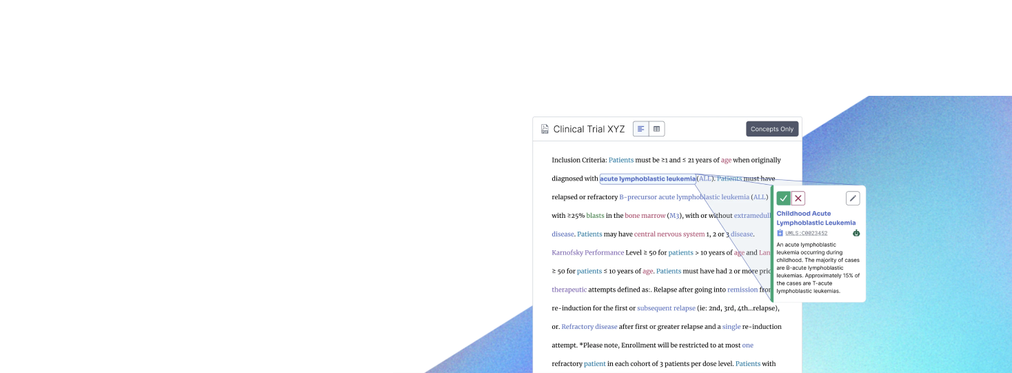
Annotating Text
Challenges:
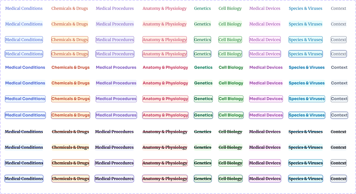
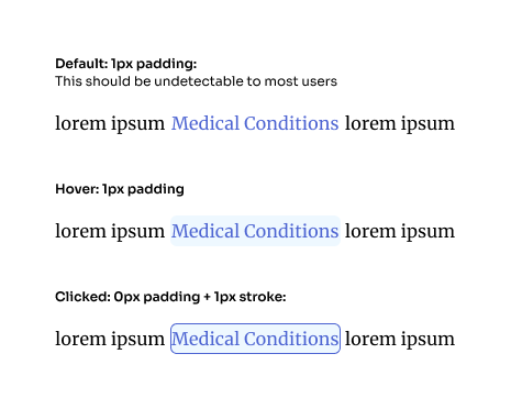
Users wanted to know which concepts were unreviewed, accepted, and rejected so they could see at a glance which concepts we’re left to review. We needed to adding 3 states (default, accepted, rejected) to these annotated concepts without affecting the readability of the document since most users read the document start to finish while reviewing.
Using 8+ colors to show meaning while adhering to accessibility standards. Accessibility is very important. Making these states visibly different using our Concept Type colors and other styles as a differentiator was a challenge.
For color accessibility we began experimenting with different stroke patterns that could be accessed in settings.
We included keyboard shortcuts for selection and arrow keys would toggle through the identified concepts for easy viewing in the right side panel.